|
|
Post by jlaird69 on Aug 9, 2013 18:10:31 GMT
Dont know how it can be said Ray Harryhausens colorisations are pretty poor he is classed as a god in movie world. there good as far as am concerned
|
|
|
|
Post by Richard Marple on Aug 9, 2013 18:35:34 GMT
Ray Harryhausen's is mostly renound for his stop motion monster effects.
I guess it's the same as Chuck Jones is normally considered one of the best of Warner Bros cartoon directors, but admitted himself that his attempts to direct Tom & Jerry shorts were sub-par.
|
|
|
|
Post by Alan Hayes on Aug 9, 2013 18:56:24 GMT
Dont know how it can be said Ray Harryhausens colorisations are pretty poor he is classed as a god in movie world. there good as far as am concerned Yellow skin tones do not a good colorisation make.  |
|
Simon Collis
Member
 I have started to dream of lost things
Posts: 536
|
Post by Simon Collis on Aug 9, 2013 18:58:50 GMT
Dont know how it can be said Ray Harryhausens colorisations are pretty poor he is classed as a god in movie world. there good as far as am concerned Yellow skin tones do not a good colorisation make. If they ever have to re-colour some episodes of The Simpsons, can I quote you on that?  |
|
|
|
Post by briancook on Aug 9, 2013 20:40:48 GMT
i have spent most of today learning a new vocabulary vidfired telerecording telesnap all sorts. reading about how they [or you if it is you on here] recoloured dr who and used NTSC home recording with the b&w film to create a good mock up of how the original would look.
I believe that if it was made in b&w it should stay as meant UNLESS the director etc wanted it in colour but was unable to afford it. the story goes that 'the longest day' was supposed to be in colour; but the film studio blew their budget on some previous production so couldn't afford it to be shot in colour!
|
|
|
|
Post by pelham cort on Aug 10, 2013 10:36:55 GMT
i have spent most of today learning a new vocabulary vidfired telerecording telesnap all sorts. reading about how they [or you if it is you on here] recoloured dr who and used NTSC home recording with the b&w film to create a good mock up of how the original would look. I believe that if it was made in b&w it should stay as meant UNLESS the director etc wanted it in colour but was unable to afford it. the story goes that 'the longest day' was supposed to be in colour; but the film studio blew their budget on some previous production so couldn't afford it to be shot in colour! Yes but it turned out the be the most expensive black and white film ever made with a $10,000,000 budget.but there was the colourised version by American film technologies(that did the hospital scene from the silurains part 5/6) in 1994,just 50 years after the invasion. |
|
|
|
Post by Rich Cornock on Aug 10, 2013 11:32:26 GMT
I don't have a problem with colourised Dr who, it's not as if the black and white versions will be destroyed. So you can always choose which version you watch. I also don't go with the argument that it's not how it was intended to be watched so shouldnt be done. Plenty of people watched programs made in colour in the 1970s on b&w sets and nobody complained that it wasn't how the director wanted it or that it ruined the program. so I fail to see the difference when it's the other way round. I think colourised Who would make the programs more acceptable to a young audience. How ever all this talk is hypothetical as at the moment it's not worth the out lay to do the work
|
|
|
|
Post by Jaspal Cheema on Aug 10, 2013 23:06:46 GMT
i have spent most of today learning a new vocabulary vidfired telerecording telesnap all sorts. reading about how they [or you if it is you on here] recoloured dr who and used NTSC home recording with the b&w film to create a good mock up of how the original would look. I believe that if it was made in b&w it should stay as meant UNLESS the director etc wanted it in colour but was unable to afford it. the story goes that 'the longest day' was supposed to be in colour; but the film studio blew their budget on some previous production so couldn't afford it to be shot in colour! The 'some previous production' was by 20th Century Fox and it was the notoriously over-blown Cleopatra which almost ruined the studio.The Queen of the Nile as portrayed by Elizabeth Taylor wouldn't have looked out of place on TOWIE...! |
|
|
|
Post by Michael B on Aug 11, 2013 9:57:07 GMT
I agree with the 'meant to be seen' idea. A simple example: the '60's TARDIS set was green to look gleaming white on black and white.
|
|
|
|
Post by pelham cort on Aug 11, 2013 11:01:23 GMT
I agree with the 'meant to be seen' idea. A simple example: the '60's TARDIS set was green to look gleaming white on black and white. Actully it was the TARDIS console that was painted green.you can tell in part 1 of the ambassadors of death and the whole of inferno. |
|
|
|
Post by Michael B on Aug 11, 2013 11:09:11 GMT
I agree with the 'meant to be seen' idea. A simple example: the '60's TARDIS set was green to look gleaming white on black and white. Actully it was the TARDIS console that was painted green.you can tell in part 1 of the ambassadors of death and the whole of inferno. Sorry, that's what I meant, obviously not the walls and all. |
|
|
|
Post by Richard Tipple on Feb 19, 2020 15:18:18 GMT
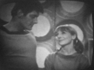
I'm very much enjoying revisiting this thread after so many years. I, along with a small but dedicated team, recently finished colourising an entire Hartnell era episode. It premiered in LA (GallifreyOne convention) on the weekend and was enjoyed by over a thousand people. I heard several stories about younger fans who had never watched early Dr. Who because they didn't engage with black and white footage. So for some this was their first exposure to the early years of the show. I've had lots of really interesting messages and feedback. The stuff I found most exciting was a) the younger fans who now wanted to watch more Hartnell and b) (generally) older fans who didn't like colourisation but went in with an open mind and enjoyed the experience. I haven't uploaded many colourisations in the past six years because I've been so focused on this project. It's been a labour of love, and the whole team have worked incredibly hard to produce something to the highest possible standard. If you'd like to see a trailer for the episode we colourised, it can be viewed here: And I spoke to BBC Breakfast this morning: www.youtube.com/watch?v=KtawY68s4fA&feature=youtu.beI understand colourisation is quite a divisive subject, and I'm entirely open to criticism, but please keep it constructive. |
|
|
|
Post by Steve Hamilton on Feb 19, 2020 16:02:47 GMT
Looks great and such a tremendous amount of work to complete it too. The dramatic music on the trailer makes it so exciting for a new audiences.
Very well done team!
|
|
|
|
Post by Robert Lia on Feb 19, 2020 21:32:05 GMT
Looks nice Richard. I am not a big fan of false colorization but this does look nice. Perhaps you should try a 4 part story say "The Ark", "The War Machines" or "The Tomb of the Cybermen" next so we can really sit back and see a 60's story in full color (with vidfire).
|
|
|
|
Post by Richard Tipple on Feb 19, 2020 22:52:36 GMT
Thanks for the kind words, Steve.
And thanks Robert, glad you like it. To colourise well you need a really good base to work with. We've spent ages restoring the film. Replacing titles, fixing all manner of bits and pieces to restore it as much as possible. The actual quality of the image is a huge step up from what's currently on the DVDs.
I find auto colourisation pretty awful tbh. I've never seen a good, non-flickery example. The ones that do look OK are very simplistic shots with little movement. I'm not convinced the quality is there yet so for best results it's best to do it manually. I think a four-parter like you've mentioned is probably a bit out of scope atm because of the time it'd take to do manually. Something like The Rescue is very possible with the right resources.
I appreciate the kind comments so far, thank you.
|
|